Ad Formats that Make You Look 😎
Impressive ad formats are easier to sell, perform better, command more money, and keep your media kit fresh and cool. Give your sales team something fun to sell this quarter.
Ad Formats
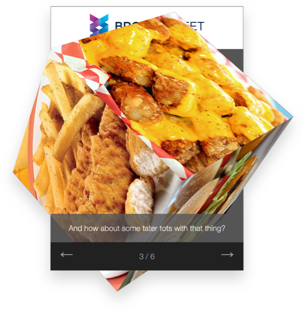
The Amazing Cube
This was based on a customer's request. We thought they were crazy. "A 3D, ROTATING AD!" they exclaimed over the phone. We built it as a proof of concept it it became the best selling ad format of all time. Just upload 6 images and a logo. It has run successfully with even the sleekest and most stylish publishers. It has become SO momentous, that Broadstreet's logo is indeed the corner of a 3D cube. See it live
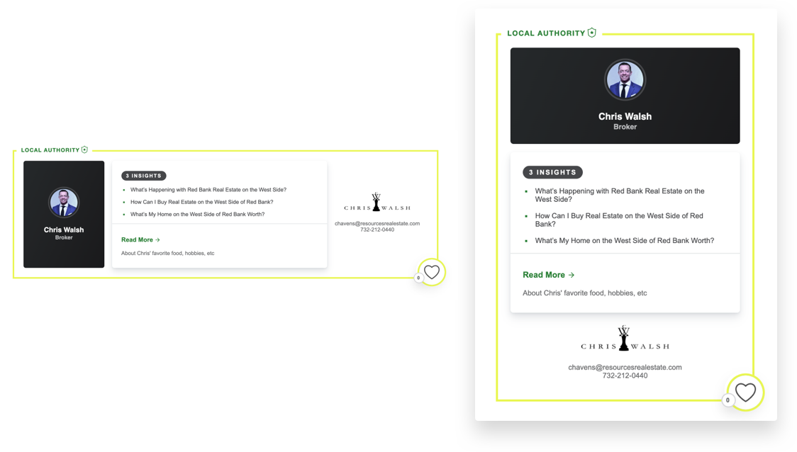
Local Authority (Skyline)
Position your local professionals as the experts that they are. Perfect for pairing with sponsored content hosted on either your website or theres. The magazine industry has their famous "Faces" campaigns — this brings Faces into the digital age and better positions the professional as an expert. See it live on the top right of redbankgreen.com.
The Billboard
Who's your dream client? Large and powerful – clear value for your client and the reporting will show it. Many Broadstreet customers kicked off their use of our product by selling a single billboard and immediately hitting 3-5x ROI on the cost of Broadstreet. In the B2B and magazine industries, it commands $2,500+ per month for publishers. See it live.

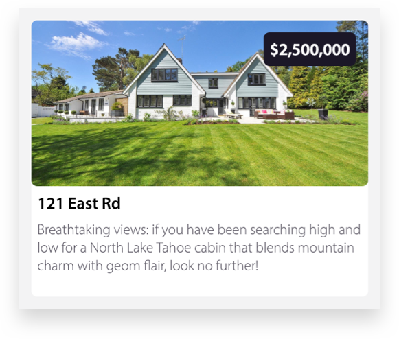
Real Estate Showcase
Ever found yourself browsing Zillow when you're not even in the market. Exactly — pictures of homes and their pricing get attention. There is no better way for a real estate agent to advertise than to simply let the pictures do the talking. See it live.
The YouTube Ad
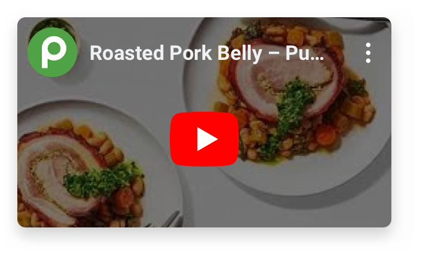
Want to make a great impression at a sales meeting? Many local businesses have amazing video content on YouTube and nobody is seeing it. With this form, you simply DROP IN THE YOUTUBE url and Broadstreet generates and ad that will showcase it. Help your client double down on that great storytelling. See it live.
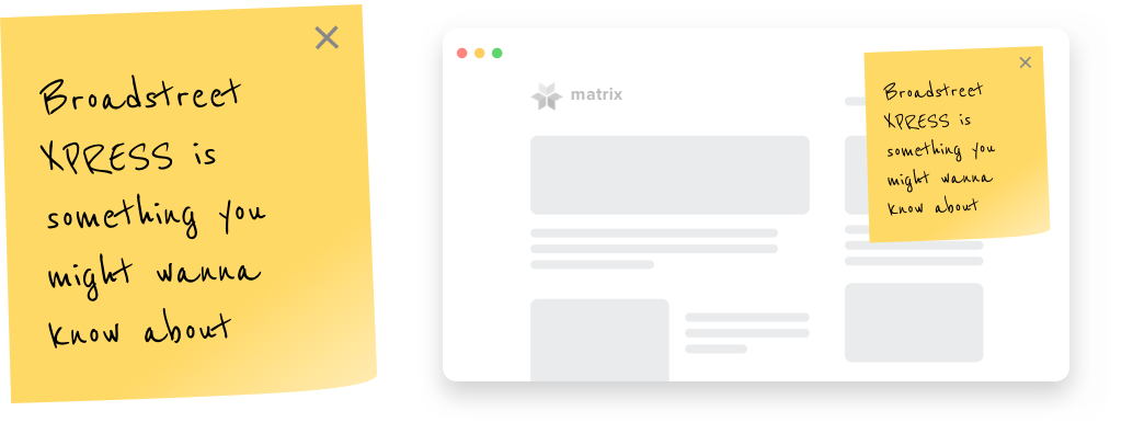
Sticky Note
Have a message that needs to “stick?" Sticky Note is a pop up that doesn’t feel like a pop up – displaying a text-only message at the top right corner of your page which can be rate-limited to prevent readers from seeing it too often.
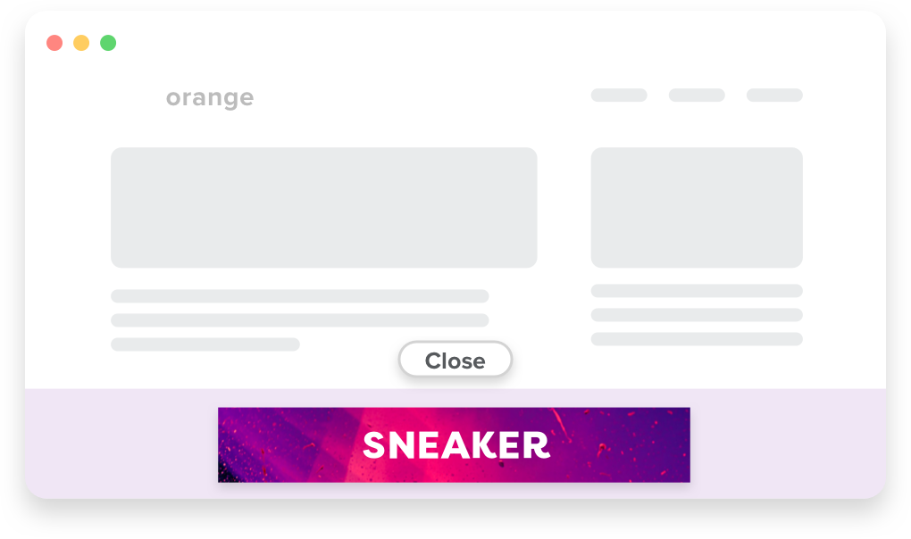
The Sneaker
Promote an advertiser with an ad that “sneaks up” from the bottom of your website. The Sneaker is sure to be seen by your readers and can be rate limited – to limit how much “sneaking” is done. “The Sneaker” only requires a graphic to function – ideal for advertiser’s with their own custom designs.
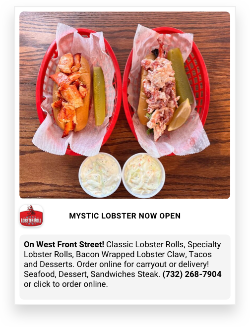
The Super Snapshot
Does the client want to get noticed? Want to send them a concept really fast? The ultimate simple spec ad, is designed to be simple to create, easy to customize, and keep clickthrough rates high. Use to build awareness, get the word out, and provide legitimately useful information to readers. Highly recommended to catch attention and stop readers in their tracks.
Glossy Gallery
Show, don’t tell. Some client types — interior designers, home contractors, beach and country clubs (eg, everyone who might advertise in a glossy magazine) look better in pictures than in words. Feature high quality photos in an elegant and UNLIMITED photo gallery. Customize the size to fit in any part of your site – in-story or between pages. See it live.
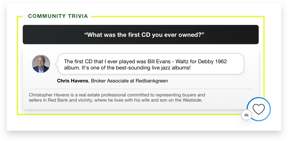
Fun Faces / Community Trivia
Local media can be a better social network than social networks are. Show the fun and personal side of your clients — don't let them be all business. This showcases and questions you want to ask your clients to bring out their personal side and create a connection with your audience. See it on story pages on redbankgreen.com. Named "Fun Faces" because it's like the magazine industry's "Faces" campaign, but it's more fun.
